Intro to Data Viz in R
Welcome to the Magic World of ggplot2

In this workshop, we’ll focus on the ggplot2 package, a cornerstone of the tidyverse package. With ggplot2, we can turn raw numbers into compelling visual stories, effortlessly communicating complex data. Whether we’re examining distributions, relationships, rankings, or trends over time, visualization helps us see what the data is truly saying.
Throughout this workshop, I’ll use the terms chart, plot, and graph interchangeably. While they may take different forms, they all share the same purpose: transforming data into something meaningful and impactful.
Load packages
This is a critical task:
Every time you open a new R session you will need to load the packages.
Failing to do so will incur in the most common errors among beginners (e.g., ” could not find function ‘x’ ” or “object ‘y’ not found”).
So please always remember to load your packages by running the
libraryfunction for each package you will use in that specific session 🤝
We will use the mpg data frame available in the ggplot2 package. ggplot2 is always loaded if you load the tidyverse package.
What is the first step when you start working with a new dataset?
Getting to know the data
It is also possible to get more info about the dataset by running the below code:
Now that we got to know the data more it is time to begin our exploratory analysis using visualizations!!!
Creating your first ggplot chart
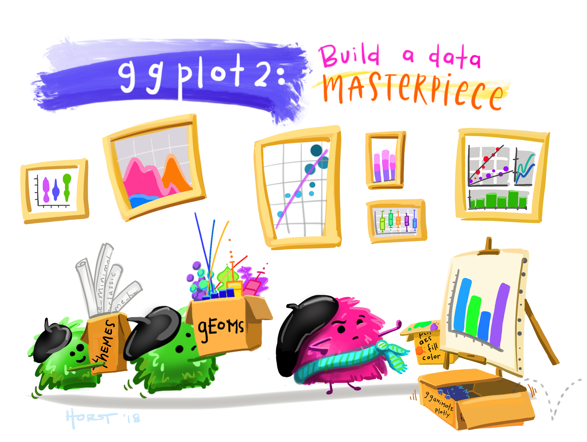
Creating a data visualization with ggplot2 is a lot like painting. You start with a blank canvas, and just like an artist, you add layers one step at a time until the picture takes shape. At first, there’s nothing there but potential.. a canvas waiting to be filled.
Each step in the process, whether it’s deciding on the chart type or choosing the colors and elements, is like adding layers of paint to a canvas. You gradually build up details, adding depth and clarity to your creation. Just as a painter chooses which areas to highlight or leave in shadow, we use tools in ggplot to emphasize different aspects of the data.
By the end, what started as a blank space becomes a visual story—a piece of art that not only looks good but also communicates meaning, helping others understand the data in a way that numbers alone can’t. Enough with the theory.. let’s see how ggplot2 works in practice:

With ggplot2, you always begin your plot with:
- the function ggplot() creates a coordinate system, your empty canvas, that you can add layers to.
- the first argument we add to our ggplot() chart is the dataset to use in the graph. While the chart is still empty now the data are loaded in the background and ready to be visualized.
- then we need to map what variables we want to visualize on our axes. So ggplot(data = mpg, mapping= aes(y=manufacturer)). While the chart core of the chart is still empty, now the axes and their scales are visible.
- The graph takes shape by choosing the type of chart you want to create. In this layer, we add the geom (short for geometric object or representation), which determines the visual structure/shape of the chart. For example, using geom_bar() adds a layer of bars, creating a bar plot. While geom_point() adds a layer of points to your plot, which creates a scatterplot.
Let’s create a few more charts to visually explore our new dataset:
Let’s now check the distribution of highway fuel efficiency among the cars in this dataset:
Notice that I have used geom_histogram and not geom_bar in this case. We will learn more about which chart is the most appropriate given the column data type later in this class.
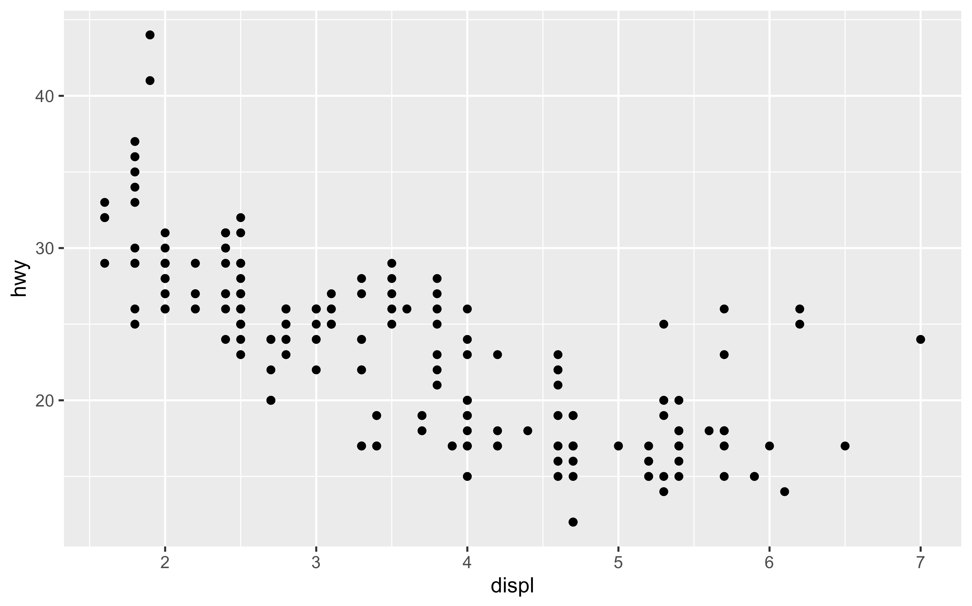
Let’s now check the relation between engine size and highway fuel efficiency. Any surprise?
Cars with big engines seem to use more fuel. But… there are a small number of cars with large engine that still have pretty good highway fuel efficiency.
Create a histogram chart that show the distribution of the city fuel efficiency (cty) variable
Create a scatterplot that shows the relationship between engine size and city fuel efficiency
Activity 1 (a & b in class c & d at home): Basic Charts - 5 minutes:
[Write code just below each instruction; finally use MS Teams R - Forum channel for help on the in class activities/homework or if you have other questions]
Create a bar chart for the class variable.
Create a scatterplot between the highway fuel efficiency and number of cylinders.
What do you notice?
Create a boxplot that show the distribution of the city fuel efficiency (cty) variable.
Create a bar chart for the fl variable.
Knowledge Check 1

Question: What geom was used in the chart above?
- answer 1: geom_bar,
- answer 2: geom_point,
- answer 3: geom_boxplot,
- answer 4: geom_plotPlease remember that this is just a demo of the workshop I run and their style. If you or your company want more info about the workshop do not hesitate to click on the Get in Touch button.
